
CMYK colors or Pantone colors, or maybe RGB?
Which color scheme to use when designing my graphics?
We would be happy to give you suggestions!
The most common are three types of color notation: RGB, CMYK and Pantone.
Which color notation is appropriate depends on the printing technology you will use to make the target print. You will ask: and which printing technique will you use to print my design? We answer: it all depends on the item or the type of garment, the number of pieces and the overall appearance of the graphic / logo.
Sound mysterious?
Below we will try to lighten up a bit on the above issues.
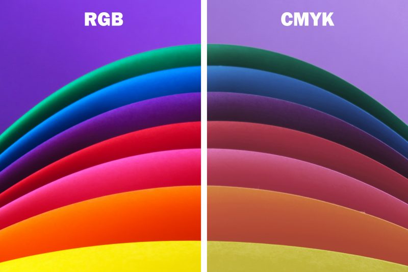
The notation of color as RGB is often used in computer science (e.g., color palettes in html files). It is widely used in devices that analyze images (e.g. digital cameras, scanners) and in devices that display images (e.g. TVs, computer monitors). Simply put: we will use RGB colors when we want to design a website or create graphics to be viewed on a computer monitor. RGB colors are not inflicted on graphics that are to be printed on clothing, advertising gadgets or printed on paper. When designing, graphics should not be inflicted with RGB colors, because what we see even on the best calibrated monitor will not be color faithful to printed materials. The exception will be the printing of multicolor graphics done with DTG technique on our machine. In this case, designs are prepared in RGB, as we can gain an extremely wide range of derived colors (wider than in CMYK). As a result, we are able to print many more shades of seemingly the same color. The printer we have will convert the colors itself in the right way for a beautiful print.
The correct forms of color notation for printing are CMYK and PANTONE.
CMYK is a set of four basic ink colors commonly used in multicolor printing in printing and related methods (inks, toners and other coloring materials in computer printers, photocopiers, etc.). The basic set of the above-mentioned name, is a set of colors consisting of the English abbreviation from the first letters of the color names CYAN, MAGENTA, YELLOW, BLACK. The set of these 4 basic colors allows us to print any illustration, photo or graphic, obtaining a multicolored image. Graphics that will be printed with CMYK are saved in tiff or png, on a transparent background, with a resolution of 300 dpi. In some cases, it can also be jpg, but you should know that they may lose colors.
Printing techniques for which we will use CMYK color notation:
- all kinds of prints on paper (business cards, flyers, posters, etc.)
- items on which UV printing is performed (e.g. pendrive credit card)
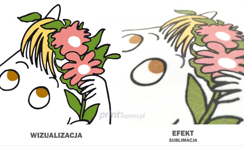
- sublimation, it can be done from 1 piece. It is one of the most durable printing techniques.
- DTG, We make from 1 pc. The print will be very durable.
We already know at what quantities which technology is used for multicolor graphics that we can print with CMYK. So let’s move on to Pantone colors and the printing techniques that use this color scheme.
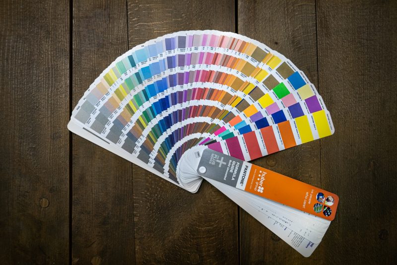
PANTONE is a color identification system developed by Pantone inc. of the USA. The basic scale describes as many as 1761 colors (and there are many more). They are created by mixing 18 pigments. Note that their reproduction on CMYK and RGB scales is not obvious.
Thanks to the use of Pantone colors, the colors of a logo or graphic, when printed, for example, on a T-shirt, will always be identical. We wouldn’t get such an effect if we created logo prints exclusively from CMYK. Each printing house prints differently, uses inks from different suppliers, not to mention machines, substrates and pigment feeding. In contrast, Pantone inks, which meet norms and strict standards, always or almost always have the same shade.
As I mentioned earlier, the reproduction of Pantones in CMYK and RGB scales is not obvious. When selecting Pantones in a graphics program, we absolutely must not rely on what the computer monitor shows. Monitors distort colors and often the printout is optically different from what we see on the computer. In order to choose the right color, you need to use a physically printed, certified Pantone color chart (if necessary and possible, you can use it in our office). There are a number of different color patterns depending on the substrate on which you want to print. For printing on advertising gadgets and clothing, colors according to the PANTONE SOLID COATED scale are used. Graphics that we will print with Pantone should be prepared in vectors. The finished design is saved in cdr, eps or pdf.
Printing techniques for which we will use PANTONE SOLID COATED color notation:
- pad printing, Pad printing – what is it?
- embroidery, it is known that embroidery is done with threads that already have their colors and we have no control over it… Pantone will be needed for us to choose the most similar shade of thread color.
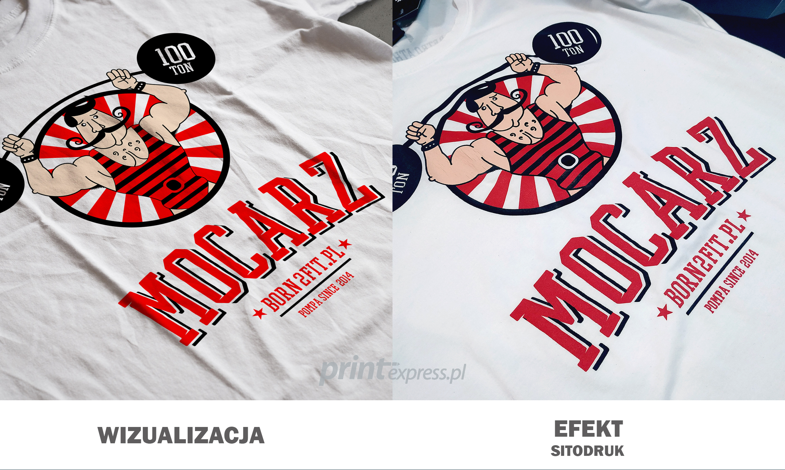
Computer embroidery - Screen printing, we do printing from 10 pcs. This is one of the most durable printing techniques.
Screen printing – the most durable marking method - screen printing with separation, multicolored graphics with gradients or color transitions can also be done with screen printing. First, our graphic designer must carry out a color separation, where he will extract a maximum of 6 main colors, and the entire print will be printed by mixing these colors so that a multicolor print is created.
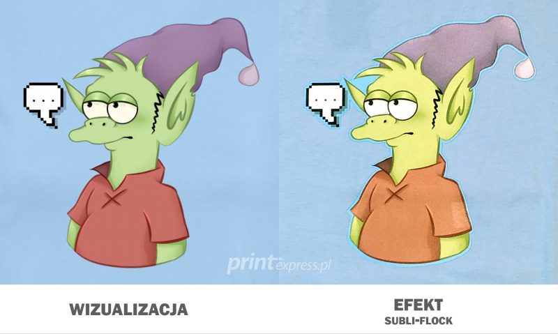
As a curiosity, I will also add that there is a printing technique in which what specific colors we inflict on the graphics does not matter at all. Why? Because these are top-down colors imposed by the manufacturer, which we can choose from a special palette. We are talking about flex (smooth) and flock (meshed) films. They can be made from 1 piece. This is a very durable printing technique. http://printexpress.pl/techniki-nadruku/termotransfer/
That would be enough about advice related to choosing the right color notation for printing. Should you need additional information, you are cordially invited to contact our office.